Saturday, September 11, 2010

Leonardo Dreams of his Flying Machine- the Binding. Ta da!


          As I'm in another time-crunch I decided to put some photos of the finished book up on the blog, and post the how-to steps when the opportunity presents. I just don't have the time to make a new web-page at the moment. Above is a view of the endpapers with two of Leonardo's sketches from his notebooks.
          I returned from the Miniature Book Conclave (highlight for me - James Reid-Cunningham's presentation) on Labor Day, having sold some books, and realized that I only have a couple of weeks to the Oak Knoll Book Fest, which I signed up for. So I'm making books for the next two weeks. I haven't attended this previously, it will be a new experience for me, which I'm looking forward to, - lots of Fine Press books, and maybe some artists' books. 
          Anyway, on to the book. I decided to sew it on vellum slips, as previously noted, dyed red to blend with the burgundy goatskin. The slips are laced into the cover giving a secure board attachment. I wanted to reference Leonardo's notebooks in the binding so extended the leather on the back board at the fore edge to form a flap, which folds over the text block and fastens with grosgrain ribbon ties. The flap is lined with a thin piece of leather and finished with a blind-tooled double line around the edge. 


 This design meant that there was really no need for a slipcase as the fore edge is protected by this extension. In turn this helps to keep the price of the book down, as boxes and slipcases are quite time-consuming to make. I used the same art-work for the title on the front cover as I had drawn for the title page, which gives the book a unity of design and the lettering is quite decorative in itself. This is a deceptively simple binding, as it involves quite a lot of work, which I shall describe at a later date.
Here are the details of the book:
Leonardo Dreams of His Flying Machine, 40 pages inclusive of blanks,almost 3 inches high by two and three eighths of an inch wide approx. It is a Limited Edition of 20 copies numbered, and signed by me, the poet Charles Anthony Silvestri and the composer Eric Whitacre, whose account of their collaboration also appears in the book.
          The book is printed on a special making of handmade paper from Griffen Mill in Ireland, using a Craftsman hand press and polymer plates, set digitally in Brioso Pro typeface designed by Robert Slimbach. The five full page illustrations were drawn especially for this book and transferred to polymer and printed on the press, onto handmade Japanese Bicchu Torinoko Gampi paper. Each illustration is individually hand-gilt and burnished using genuine gold leaf. There are five of Leonardo's studies of creatures that fly, from his notebooks, two as shown above, plus a bat, moth and flying fish. 
           This book is copyright Janet Kellett, and the words of the song are copyright Charles Anthony Silvestri, with the account of the collaboration being copyright Eric Whitacre. Please respect our copyrights.
           The price of this book is CD$450.00, which presently equates to US$425.00, plus shipping and insurance. Publication date was Sept 5th 2010, and the edition is half sold as of today. Please contact me through my website with your street address if you would like a hard-copy book announcement, or if you would like to purchase a copy of the book.
          I shall be attending the Oak Knoll Book Fest in Newcastle Delaware, on the first weekend in October, and you can see the book there, along with a few other titles of my books that are still in print.
I'll post at a later time with all the steps in making this binding. This book has been quite a journey and the discipline of writing this blog, trying to remember to take photos and explaining my thought processes has been also quite an experience. Thanks to all those who have followed along with me.  

Tuesday, August 10, 2010

In a (book) Bind

          I've been enjoying some fun family time and now I have to get down to serious work, if I am ever to finish this book before the Miniature Book Society Conclave in Lexington Kentucky. It takes place over the first weekend in September (Labour Day weekend) and I must have some books ready by then, less that four weeks to go! On the Sunday afternoon the Book Fair will be open to the public, at the Hyatt, Lexington. See the website for details. Hope to see you there!
          I finished off the last image, of the figure rising through the air towards the skies, using brass handle tools in the shape of a star and a dot. (They are really for gilding leather but also work well on paper.) The tools are heated to the right temperature to activate the adhesive on the foil carrier. This is a layer of real gold on a backing. The foil is placed on the surface to be gilded and the heated tool is impressed on to the foil, transferring the layer of gold to the substrate, in this case the paper. The shape of the tool appears in gold.
Here is the starry result. The next operation was to tip the five images into each book. This means that the image is adhered by a thin thread of glue or paste along one edge onto the page. I did this before trimming the pages, using the guillotine. In other types of binding (anything with a rounded and backed spine ) I would use a plough to trim the edges, but this is a thin book with a flat spine.
          After some consideration I have decided to bind this book by sewing on vellum slips. A vellum slip is a strip of vellum, and vellum is of course a piece of (usually) goat or calf skin that has gone through a special curing process to give it the particular qualities needed for writing or binding. It is very durable, and I adapted a traditional form of binding using the vellum slips when binding Old London Bridge. It enables the book to open well (which can be a problem with some forms of binding) and I like the appearance and the medieval reference to vellum bindings, which is probably what would have been on Leonardo Da Vinci's original notebooks if they were bound during his lifetime.
          I looked into my 'supplies store', well O.K., a drawer and found some vellum of a suitable thickness, that was dyed a tan brown colour, quite a good base to adapt to red, to tone with the leather of the cover. I used Fiebings Oil-based red dye, rubbing it into the surface with a pad of paper towel. It does not penetrate into the vellum, but rather sits on top, and takes a good few days for the dyestuff to oxidize and dry.Here's the before and after:


The vellum doesn't need to be an exact match for the leather as it will hardly show, it just needs to blend in. I have no idea why I originally bought this vellum, (twenty-five years ago at least) as it is much too thick for writing or binding a small book, but I was very pleased to find it, it's exactly what I needed for this job. The next process will be to sew the book, when the vellum is dry.
          I'm going to go 'underground' for the next few weeks as I'm really pushed for time to get some books finished, and also am preparing a presentation for the MBS Conclave, but I will be taking photos and will show all the stages in this binding when I return from Lexington.


Monday, June 28, 2010

Endpapers, gilded suns and non-drying ink

          With the main bulk of the printing out of the way, I turned my attention to the endpapers, an important item in the book as they the first thing you see when you lift the cover. I like to relate them to the content of the book in some way. I had decided to go with the tea-stained paper (see previous post Feb, The Real Leonardo) and overprint this with two of Leonardo's line drawings that relate to flight. One of these is the dragonfly, the other is his little drawing of a man hanging from his 'parachute', which he describes as a wooden frame covered in fine linen, and treated with flour paste to make it air-tight.
          It involved several applications of tea to get the depth of shade, then I dried them completely under weight, then re-dampened, printed, dried and pressed again. A bit fussy to do, but I was pleased with the result, and it is a way of incorporating more of Leonardo's delightful line drawings into the book.
          I've also been working on the illustrations, using the PVA gilding idea (see previous post, April, A Sticky Gilding Situation). This is how two of them look. You can see why they call gilding 'illumination'.
I had a bit of a set-back with one of my images, I printed a figure in a red oil-based ink, using a stencil and brayer. So far, so good. But it took weeks to dry, and even when seemingly dry the red came off when gently rubbed with a tissue. I did't want to risk it inside the book in case it offset onto the opposite page. 
          So what to do? I looked back through all my experiments with various papers and media and looked at the ones where I used the same paper and Akua Kolors. The colours I have are the ones used for wood and lino cut printing, they are quite liquid, but if you leave them out to air-dry then can be used with a brayer, or you can thicken them with tack thickener. As mentioned, I was low on paper for the images, so by this time I was working on small offcut pieces of paper. They were big enough for the image, but tricky to print on, and I intended to overprint the figure with a cloud image on polymer plate, which I did. To stop the little pieces of paper dropping off the press I used a dab of the roller non-permanent adhesive on the mylar sheet I have on top of the tympan, and that was sufficient to keep them in place and prevent them from sticking to the plate. This image goes with the words "the triumph of a human being ascending, in the dreaming of a mortal man", so I hope this looks sufficiently dream-like and insubstantial. 

Tuesday, June 8, 2010

Let the Printing Games Begin

Ahhh...the scent of printers' ink and press wash....nothing quite like it. The plates arrived and after checking them over, I cut them apart and started planning the printing. I decided to print the full page images first, and spent the rest of the afternoon cutting up paper. I found there was only just enough, as after ordering, I had decided to include an extra image. Oops! I shall have to be extra careful. 

The plates for the images have some larger solid printed areas which made adjustments necessary. My old table-top Craftsman press was built as a jobbing press, for printing small jobs such as tickets, and invitations. Because of its clamshell action, it is not ideally suited for printing large solid areas, not usually an issue for me. So for these images, I had to make several adjustments to rollers, ink and packing in order to get the solid black areas to print well. I then had to print with my full weight on the handle to get enough pressure. I printed dry on this handmade 30 gsm Japanese paper, as I didn't want to spoil the beautiful surface by dampening it. Anyway, the alterations worked. Looking at the handle of this press, which has been welded  at some time in its career, my guess is that I'm not the first to throw my full weight on it. I just hope it holds out.

The text printing went well, the damp paper gives a lovely crisp impression and again, as this was the Griffen Mill handmade paper I proceeded extra slowly and carefully. This paper has a watermark in the corner of each sheet, with the letters GM, the infinity sign (to indicate its archival status) and the initials MG for Mike Gibbs, the papermaker. I love the thought that I'm making a book with paper made by a real person, a person I have actually met, and that the paper could last for hundreds of years. I have a bible dating back to 1589, in the reign of Queen Elizabeth I. It is beautifully printed, the presswork is amazing and although it is pretty beaten up, still an object of my admiration for the skill that went into making the paper and printing it all those 400+ years ago.

Because the paper had been dampened I let it dry off a little and when it showed signs of curling, finished the drying process between blotters under a light weight.
         
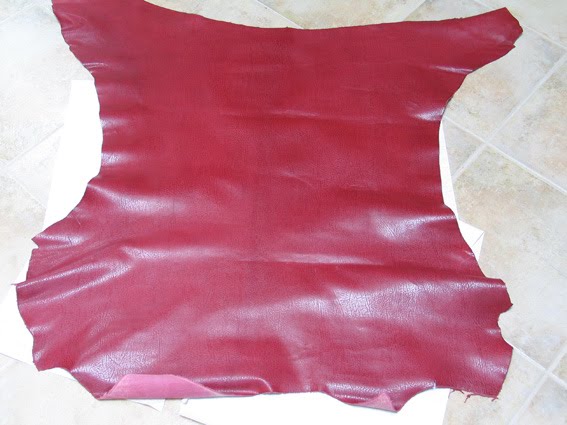
 During the time I was printing, my leather arrived! I had chosen it from a swatch on a card, so was not really surprised to find that it was slightly different in colour from what I had expected. One batch of leather never dyes the same as the next, it's a fact of life. This skin was a little brighter and redder than I expected, but still a very nice skin, as you can see. 


Monday, May 24, 2010

Gathering the Threads

          Making up the dummy book, as in my last post, is quite exciting as the book gradually emerges from a morass of experiments, maybes and possibilities. I'm temperamentally unable to visualize a book in its entirety from start to finish because there are so many variables and because I want the book to be the best that it can be, so I leave lots of options open.
          Unexpected things always happen, for example I thought I was ordering the leather in good time, from J Hewit in Scotland, but when I contacted them, discovered that they are moving the tannery twelve miles to another location in July, so certain colours may not be available. I have ordered a sort of 'old burgundy' colour which I will show you when it arrives. And would you believe, businesses actually have holidays and some close down for a week or two in the summer??? They will be paying people salaries next. 

Shown here is a mock-up of the title page and frontispiece for 'Leonardo'..., it really is taking shape at last. As you can see, a rough and ready paste-up, but it is enough to show whether the size of text and image are good, or what needs tweaking. 

          I have also ordered the magnesium die from a company called Owosso Graphic Arts, this will be used to gold block the title on the cover. The handmade Japanese paper for the illustrations is safely stored in my old map chest, now everything is waiting for the polymer plates to arrive so I can start printing. I have tracked the parcel of plates to Vancouver Customs .....today is a holiday, so I'm hoping for delivery tomorrow or Wednesday. 
          One other little but very important detail: I asked Tony Silvestri and Eric Whitacre if they would like to sign the book, and they have both agreed - happy dance-this will make a very special book! Now we just have to fit this into their busy schedules....I am so pleased they want to do this.


Friday, May 14, 2010

And so to Text...Layout, that is.

Having completed the five full-page images (yes, I'm saving two as a surprise), I'm now in a position to lay out the text properly. I should mention that way back last summer, when I was searching for a suitable paper, I did a very rough layout calculation to ascertain the number of pages (and the amount of paper) that I would need. I ordered the paper to be custom-made at Griffin Mill (see Paper Trails) and it is now sitting under my bed, well-matured by now.
          I always make a rough mock-up of the book, starting with the number of pages I think I will need. This book came out to about thirty-six pages (some of which are blank), that is, eighteen leaves. I decided on three sections of twelve pages. This is not the usual layout. I keep the sections fairly small as the binding works better, rather than having a few large (i.e. fat) sections. Making a mock-up shows where adjustments need to be made, I print out the computer layout and images, and stick them into the folded pages, and move them about as necessary. Apart from the text pages, you have to allow for half-title, title page, frontis, business info (ISBN, copyrights, press info, acknowledgements, colophon, limited edition and signature info, table of contents, bibliography - mix and match as applicable).
It is important before designing the book to take into account the number of illustrations and where they will appear in the text, so the book is balanced. It can look odd to have a whole bunch of illustrations in one part of the book and none in another. (Seems obvious, but inevitably you find lots of ideas for certain parts of the text and none for others.)
          I had already decided on the font I would be using, Brioso Pro (see Prince of Fonts),and firstly tried a traditional layout, aligned to the left like a formal poem, with any extra words that wouldn't fit moved to the next line down, with an indent (below, left in the photo). 
I didn't like the look of this, it seemed rather lifeless and uninteresting.


One of the problems with a miniature book is that when you use small font sizes, you lose the beauty of the letterforms and it is difficult to read. The text is after all in 
many books the most important thing about it. Illustrations, paper, binding are there to support the text, so I use a slightly larger size than you might expect, and in this case I'm using 11pt for the body of the text. I then decided to play around with the words, to make them visually more lively and interesting, to match their meaning. Sometimes you can draw attention or contribute to their meaning by the way you arrange them on the page. This includes keeping certain words together, and sometimes emphasizing them by giving them more space, as I have done with this 'siren-song' verse.I laid it out as if I were doing a piece of calligraphy, and for me this works better than the formal arrangement. The photo on the right  also shows again the trial printing I did, using a polymer plate on the handmade paper. So all the image and text files have been sent off to Boxcar Press for processing into photo-polymer plates, and should take about a week to come back to me - Canada Customs permitting. 


And now a treat, a new online exhibition of artists' books, "Canadian Women Artists' Books: The Creative Codex and its variants" from the Bruce Peel Special Collections Library at the University of Alberta, Edmonton. Feast your eyes on these gorgeous books!

Sunday, May 2, 2010

"Softly whispering their siren-song..."

Silvestri's verse for this next illustration is as follows:
"And as he's dreaming the heavens call him, softly whispering their siren-song: Leonardo, Leonardo vieni á volare!
(Leonardo, Leonardo come fly!)
Silvestri imagines Leonardo being tortured in his dreams by the entreaties of the sirens, to the extent that he decides to make a flying machine and fly.
          I researched 'sirens' and found that the early ones from Greek mythology were malevolent bird-women, portrayed as seducers who lived on an island surrounded by rocks and cliffs. Ships were lured onto the rocks by their enchanting music and singing, and became shipwrecked. They were depicted on statuary and on vases as women with wings, with birds' feet, something like rather dumpy angels. In later stories they became aquatic and mermaid-like. For this work I thought it more appropriate to have them airborne, and made them a little more visually tempting. Wiki tells me that: In his notebooks, Leonardo Da Vinci wrote of the siren, "The siren sings so sweetly that she lulls the mariners to sleep; then she climbs upon the ships and kills the sleeping mariners." Oops! Leonardo is evidently aware of the dangers of flying, as he comments in his notebooks that it would be best to try out a flying machine over water, with inflated wine-skins for safety, in case of wing malfunction. 
  I work on illustrations in what is undoubtedly a very old-fashioned way. I start by making many thumbnail sketches - actually about the size that the finished image will be. Then when I've found something I like, I draw it out on tracing paper twice the size of the finished image, so that when it is resized down the detail and line quality look neater. As the drawing progresses I scan it in and reduce it from time to time to keep track of how it will look in the finished size. Tracing paper erases extremely well and it saves time in repositioning elements of the image if I need to. The tracing is then used to transfer the outlines of the image to a bleed-proof paper, where I work on it in ink with a technical pen and then scan it into Photoshop Elements to erase unwanted 'blips' and generally tidy it up, and finally put it in the right mode and file type for the platemaker. At the top of my wish-list is a Wacom tablet Intuos4, which would probably make my life easier. If anyone out there has used one of these, please tell us about it!
          I recently discovered a good and reasonably priced bleed-proof paper, Pen Sketcher's, made by Bee Paper. I have countless pads of so-called bleed-proof, this is the best paper I've found to date.
          The tracing paper method was advocated years ago by Marie Angel, the very accomplished calligrapher and artist, in her book "Painting for Calligraphers," and I subsequently read that the great illustrator Edmund Dulac used the same working method, but before he died destroyed his tracings as he didn't want people to know that was how he worked.
          Here is a great resource for design and print-making blogs.