Showing posts with label Griffen Mill. Show all posts

Saturday, September 11, 2010

Leonardo Dreams of his Flying Machine- the Binding. Ta da!


          As I'm in another time-crunch I decided to put some photos of the finished book up on the blog, and post the how-to steps when the opportunity presents. I just don't have the time to make a new web-page at the moment. Above is a view of the endpapers with two of Leonardo's sketches from his notebooks.
          I returned from the Miniature Book Conclave (highlight for me - James Reid-Cunningham's presentation) on Labor Day, having sold some books, and realized that I only have a couple of weeks to the Oak Knoll Book Fest, which I signed up for. So I'm making books for the next two weeks. I haven't attended this previously, it will be a new experience for me, which I'm looking forward to, - lots of Fine Press books, and maybe some artists' books. 
          Anyway, on to the book. I decided to sew it on vellum slips, as previously noted, dyed red to blend with the burgundy goatskin. The slips are laced into the cover giving a secure board attachment. I wanted to reference Leonardo's notebooks in the binding so extended the leather on the back board at the fore edge to form a flap, which folds over the text block and fastens with grosgrain ribbon ties. The flap is lined with a thin piece of leather and finished with a blind-tooled double line around the edge. 


 This design meant that there was really no need for a slipcase as the fore edge is protected by this extension. In turn this helps to keep the price of the book down, as boxes and slipcases are quite time-consuming to make. I used the same art-work for the title on the front cover as I had drawn for the title page, which gives the book a unity of design and the lettering is quite decorative in itself. This is a deceptively simple binding, as it involves quite a lot of work, which I shall describe at a later date.
Here are the details of the book:
Leonardo Dreams of His Flying Machine, 40 pages inclusive of blanks,almost 3 inches high by two and three eighths of an inch wide approx. It is a Limited Edition of 20 copies numbered, and signed by me, the poet Charles Anthony Silvestri and the composer Eric Whitacre, whose account of their collaboration also appears in the book.
          The book is printed on a special making of handmade paper from Griffen Mill in Ireland, using a Craftsman hand press and polymer plates, set digitally in Brioso Pro typeface designed by Robert Slimbach. The five full page illustrations were drawn especially for this book and transferred to polymer and printed on the press, onto handmade Japanese Bicchu Torinoko Gampi paper. Each illustration is individually hand-gilt and burnished using genuine gold leaf. There are five of Leonardo's studies of creatures that fly, from his notebooks, two as shown above, plus a bat, moth and flying fish. 
           This book is copyright Janet Kellett, and the words of the song are copyright Charles Anthony Silvestri, with the account of the collaboration being copyright Eric Whitacre. Please respect our copyrights.
           The price of this book is CD$450.00, which presently equates to US$425.00, plus shipping and insurance. Publication date was Sept 5th 2010, and the edition is half sold as of today. Please contact me through my website with your street address if you would like a hard-copy book announcement, or if you would like to purchase a copy of the book.
          I shall be attending the Oak Knoll Book Fest in Newcastle Delaware, on the first weekend in October, and you can see the book there, along with a few other titles of my books that are still in print.
I'll post at a later time with all the steps in making this binding. This book has been quite a journey and the discipline of writing this blog, trying to remember to take photos and explaining my thought processes has been also quite an experience. Thanks to all those who have followed along with me.  

Tuesday, June 8, 2010

Let the Printing Games Begin

Ahhh...the scent of printers' ink and press wash....nothing quite like it. The plates arrived and after checking them over, I cut them apart and started planning the printing. I decided to print the full page images first, and spent the rest of the afternoon cutting up paper. I found there was only just enough, as after ordering, I had decided to include an extra image. Oops! I shall have to be extra careful. 

The plates for the images have some larger solid printed areas which made adjustments necessary. My old table-top Craftsman press was built as a jobbing press, for printing small jobs such as tickets, and invitations. Because of its clamshell action, it is not ideally suited for printing large solid areas, not usually an issue for me. So for these images, I had to make several adjustments to rollers, ink and packing in order to get the solid black areas to print well. I then had to print with my full weight on the handle to get enough pressure. I printed dry on this handmade 30 gsm Japanese paper, as I didn't want to spoil the beautiful surface by dampening it. Anyway, the alterations worked. Looking at the handle of this press, which has been welded  at some time in its career, my guess is that I'm not the first to throw my full weight on it. I just hope it holds out.

The text printing went well, the damp paper gives a lovely crisp impression and again, as this was the Griffen Mill handmade paper I proceeded extra slowly and carefully. This paper has a watermark in the corner of each sheet, with the letters GM, the infinity sign (to indicate its archival status) and the initials MG for Mike Gibbs, the papermaker. I love the thought that I'm making a book with paper made by a real person, a person I have actually met, and that the paper could last for hundreds of years. I have a bible dating back to 1589, in the reign of Queen Elizabeth I. It is beautifully printed, the presswork is amazing and although it is pretty beaten up, still an object of my admiration for the skill that went into making the paper and printing it all those 400+ years ago.

Because the paper had been dampened I let it dry off a little and when it showed signs of curling, finished the drying process between blotters under a light weight.
         
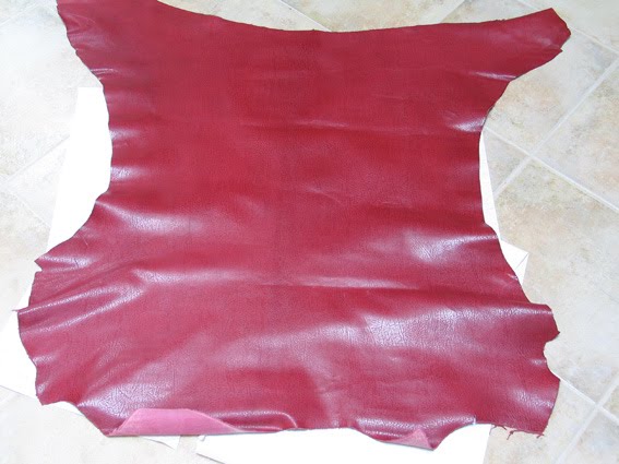
 During the time I was printing, my leather arrived! I had chosen it from a swatch on a card, so was not really surprised to find that it was slightly different in colour from what I had expected. One batch of leather never dyes the same as the next, it's a fact of life. This skin was a little brighter and redder than I expected, but still a very nice skin, as you can see. 


Sunday, February 28, 2010

The Real Leonardo Da Vinci

Leonardo Dreams of His Flying Machine          For newcomers to this blog, or those who have forgotten what it's about, here's a link to "Leonardo Dreams of His Flying Machine" on Vimeo, performed by the Brigham Young Singers  and made to advertise their concert last year. I love their enthusiasm.  There are lots of other versions on Youtube, the BYU singers is my favourite. 
          Looking through the facsimile pages of Leonardo's notebooks for his early studies of wings, I came across a page fragment with four separate sketches of different types of winged creatures, none of them birds. I reproduce it here, you can see a dragonfly, insect (? moth or fly), flying fish and a bat. 
The pen-strokes are rapid but controlled and sometimes don't quite join up, and he doesn't bother to complete the opposite wings of the fish and the bat, they are taken as read, being the mirror images of the first side. They are notes on his observations, aides memoirs. The dragonfly's legs are haphazardly drawn, but they are of no concern to Leonardo, it is the wings that interest him. 
      I find the sketch of the bat particularly fascinating as to me it reveals Leonardo the man, enjoying his own joke, his old retainer holding out the wing of this enormous bat, the wing being almost the size of his retainer's cloak, the body of the bat being the size of a large lamb. 
      The retainer's expression is one of comical earnestness, he's holding the bat's voluminous wing and the quality of the drawing is such that one can almost feel his grip on it. The hooded cloak is drawn in some detail, almost as though Leonardo couldn't help reproducing the folds of this garment. I love this drawing for its immediacy, skilful execution and its humour, it brings the genius that was Leonardo Da Vinci to life.
      I will use some of his early sketches for the preliminary pages of the book, to lead the reader in to the text of Tony Silvestri's poem. To help set the mood, I decided to colour the paper (Griffen Mill's handmade-see earlier posts) to emulate the pages of the notebook. I stained down a couple of trial pieces, using tea. I made it fairly weak, and applied with a large soft brush to damp paper which was taped to a formica-faced board with masking tape to keep it flat. It took three applications and dryings to get the colour and I made it a little uneven. Of course, it stretches and bubbles up when wet, but dries back flat. You can use a hair-dryer to hasten the drying process. I was quite pleased with the result and will try printing on it when I next have the press inked up. 

Tuesday, January 5, 2010

Etruscan Light at the end of a 'Tormented' Tunnel

          So, the polymer plates arrived on the Monday before Christmas, and I prepared some paper on Tuesday evening ready for printing trials on Wednesday. The preparation consisted of cutting the trial papers to size, labelling them (very important) and layering same between sheets of damp blotting paper so that the paper picks up enough moisture to feel cold to the touch, but is not visibly wet. Leaving overnight or for a few hours gives the moisture time to even out so the sheet is uniformly damp. It will print very much better, more evenly and darker using less pressure than if printed dry. After a few prints on practice paper I printed the image 'Tormented'... onto some Torinoko Lightweight Japanese paper (from McClaines) and it printed very well. I had anticipated some difficulty with the solid black areas (the falling figure looks a little concave on the plate) but it was fine. I used a fairly hard packing, as I didn't want the image punched into the paper too hard.
          I next printed the plate of trial text in different sizes of Brioso Light onto the Griffen Mill handmade paper, and was very pleased with the result and glad I had chosen the Light version. You can never really know until you try it. I'll probably use the 17pt size on the title page as I think it rather handsome. 


  I then experimented with various Japanese papers, Akua colors and pochoir, using brayers instead of brushes. With my previous use of this method, the repetitive motion gave me severe shoulder and neck pain, and started my quest for an alternative method of obtaining colour prints, hence the foray into woodblock and wood engraving. I intended to use some small brayers and cut some Mylar stencils. I then had to break off for Christmas preparations.
          After the break, I tried out the stencils with brayers, and found that the surface of most of the Japanese papers was not sufficiently sealed (not sized enough) to take the action of the brayer and a fairly stiff ink. The fibres 'picked' with just one layer of ink. For use with a brayer (roller) the ink has to be of a stiff consistency otherwise it doesn't coat the surface of the brayer evenly and slides about on the ink palette. I tried one western paper, a Zerkall book wove in a soft white colour, which worked well, but I disliked the appearance of it next to the Griffen Mill handmade text paper. Also, the coloured inks always look better on a white paper. So where am I now?

          Some months ago, I obtained samples of a lovely range of Japanese papers, thin and translucent, in various colours. They were truly beautiful, but at the time I couldn't see how they would work with my colour woodblock ideas. A couple of days ago, during my research on sirens for one of the other images ("..softly whispering their siren song"..), I came across some pictures of ancient (BC) Etruscan vases, and light dawned. The Etruscans were the people of an ancient civilization thought to predate the Romans, and they occupied part of the area of Italy now known as Tuscany. How very appropriate, I thought. I have no idea if Leonardo actually would have seen these ancient pots, but I like to think he may have known of them. Here are some examples:
The Etruscans decorated their vases in various tan and biscuit shades with black, and sometimes dark blue and maroon. I could achieve this elegant and sophisticated look using the coloured papers. I tried the "Tormented.." plate, printing dry, and love the look, it opens up all sorts of possibilities for the other images, and will set the character for this book. It is a break-through moment for me, as I have been endlessly obsessing about the 'how' and now I can concentrate on the 'what', knowing how it will appear.


Here are the prints drying on the line (an idea I took 
from various other printmakers, including Sue Woollatt and Andy English - thanks guys). I also show some of the prints on the Bicchu torinko paper from the Japanese Paper Place in Toronto. They are handmade, and dried on wooden boards, which gives them a little texture and character.
          The prints are not quite done, as there is still another experiment I have to do, but that will be in another blog post, when the material I ordered in November finally arrives - good old UK Post Office. Well, that's quite enough excitement for this week.


Wednesday, December 9, 2009

To carve or not to carve, that is the question...

Whether 'tis nobler in the mind to suffer the slings and arrows of engraving a piece of hard wood or Resingrave with sharp chisels... Sorry, Will, that was a little uncalled-for. So, what are my choices?
          I could engrave blocks of Resingrave or wood, plywood or lino, and use either oil or water-based inks, and print on a press or hand-burnish with a baren. So many choices, just the one life. All of these choices are going to be just as difficult for me, bearing in mind the previous injuries to my hands and elbows, so I have to find a way to make and print the blocks that is not going to damage my puny body. The best way I can think of, which will enable me to print on the press and cut down on the carving, is to have polymer plates made up that will replicate the 'key-block' in the coloured woodcut method, and then to cut some lino blocks for the areas of colours. Lino is softer to carve than the other types of blocks. It doesn't hold the detail as well, but that's OK because the detail will be on the polymer.  I may even be able to print some of the images by the reduction method. In my internet searches I haven't come across anyone using the polymer/lino combination, but there is a first time for everything. (Have you tried it? I'd love to hear.) The difficult bit will be getting the correct registration of the lino blocks with the polymer. Well, challenges are good. I'm still not sure about the inks but that will become clear when I start to experiment.
          I re-drew "Tormented..", scanned it in and resized it to the page size of the book, ready to send the digital file to Boxcar in Syracuse. I also decided to have a test plate made with Brioso Italic Light, to try out with the handmade Griffen Mill paper. That way I won't waste too much money if my Prince of Fonts turns out to be a toad after all. The photopolymer plate process 'etches' away the plate in the white areas of the drawing leaving the black areas raised and printable. One of the good things about polymer plates is that you can cut them apart like puzzle blocks and print the parts separately, for different colours. I would really have preferred to make this key-block in the traditional way, but I do want to finish this book before my ninetieth birthday. Here is the cleaned up and re-drawn version of "Tormented by visions of flight and falling"...I have used coloured pencils on the black and white image to


show how it might look. The actual size of this image will be 70 mm high, 55 mm wide, (about two and three quarter inches high by two and one eighth inches wide),  the same size as the book pages. The plates have been processed, I'm now waiting for the US Postal Service to do their bit.
          Here comes a shameless plug for the Fine Press Book Association, our only association of its kind in North America, and possibly in the English-speaking world. (Please correct me if I'm wrong, I'd love to hear of the existence of something similar in say Australia or New Zealand.) Like all great cultural things, it is in need of support in these times of economic hardship. I know, you can't eat it or put it in your tank, but...They say a nation is judged by its culture, so let's make sure we have something left to judge us by when the dust settles. New members and donations welcome.
          The President of FPBA, Bob McCamant, wrote an article for The Caxtonian which was published in June 2008, on interviews conducted with several BC Private Presses. De Walden press is pleased to be included. Fine Press is alive and well in North America. End of shameless plug, thanks for reading, and Many Happies for the coming holiday season.             


Friday, August 14, 2009

Paper Trail II


After a wonderful three day workshop, (of which more later), I'm back on the paper trail. The image left (courtesy of Griffen Mill), shows hand papermaking. So, handmade, mouldmade or machine made? It's 'make your mind up' time.

This book involves three outstanding men, the legendary Leonardo Da Vinci, the brilliant composer Eric Whitacre, and the multi-talented poet and artist Charles Anthony Silvestri. To me, there is no better paper for this purpose than a handmade paper, because it not only looks and feels beautiful, it has no grain, it is strong and durable, and is archivally sound. It takes letterpress well (they were, after all, made for each other), and will contribute towards the character of the book, without taking centre stage.

Having decided on a handmade paper, I then went back and leafed through the samples from Griffen Mill again, feeling them between my fingers and trying to decide which to choose. Like Goldilocks, I found them "too this" or "too that", not enough of the other, or just plain ho hum. My paper had to have star quality. In the file I found an envelope containing a few pieces of a very nice paper, warm toned, and quite opaque for its lighter weight. Looking at the post-mark, I remembered receiving them a few years previously, and the colour didn't suit the project I was then working on. Now, I thought, it looked just right. I conditioned (dampened) a few pieces of it for a printing trial, and tried it out the next day. It printed beautifully. Now to see if it was available, as it was not one of the stock papers.

After a couple of emails, I found that no, this had been a Special Making and there was not enough left over to make my book edition. But if I wasn't in a hurry, I could commission a Special Making and they could perhaps improve on the opacity by adjusting the fibre content. The minimum quantity for Special Making is around the amount I need for this book, 25-30 sheets, and the price about the same as the average of their papers of this weight. What did Chris mean, 'if I wasn't in a hurry'? It transpired that the paper has to mature or condition over a period of twelve weeks after being made, and "during this time the stresses and strains dissipate and the surface closes up" to quote Chris. Well, having some months work ahead on illustrations and the rest of the book, waiting twelve weeks was no problem. Game on.

One slight hitch: they were not sure exactly which paper I was talking about, as they had made two or three similar papers around that time. Could I send them a sample of the paper I wanted? So that went off in the post. After posting the sample (of course), I discovered that I had sent it to the previous address. Luckily the postman knew them, and it was delivered a few days later. That done, it was plain sailing, for me at any rate. Mike collected some fibres from the U.K. and a few weeks later, the paper was made, and on its way across the Atlantic. Yesterday it arrived. Wow, what a beautiful paper, even better than I hoped, it is a creamy colour, with a soft smooth surface, like a hen's egg. It is now under the bed, between boards, relaxing and maturing. I can hardly wait to try it.

I asked Chris to write a few words about Special Makings and handmade paper, here is what she wrote:

"Paper is a one of the major elements in book construction and as such its character, or lack of, can have a major affect on the way a book functions. For example, a well constructed book should be able to open easily and its pages turn and lie flat. With miniature books in particular, many problems are more apparent and so the correct choice of paper is vital. The appearance of the paper in a miniature book is also more striking simply because the visual elements are stronger.

The way that a paper functions is also critical when it comes to book restoration and con-servation. Here the aim is to match the character of the original paper in a sympathetic and ethical manner.

Despite thousands of different papers being available today sometimes the only way to obtain a paper that works in the context of a particular project is to have one made. If one wants a small amount of sheets only then the sole recourse is to approach a handmade paper mill where paper can be made in relatively small quantities.

"Leonardo Dreams of his Flying Machine" will be made using just such a paper, commissioned from Griffen Mill in Ireland. The wove paper is made from a mixture of jute, cotton and hemp fibres and has a subtle “antique” tone that harks back to the colours of the handmade paper used by Michael Angelo. The paper is of archival quality and is unique to this edition."

So the Paper Trail for a text paper ends here. Chris Laver-Gibbs will be making a presentation to the Conference attendees at the Society of Bookbinders Conference at the University of Warwick, UK. If you get the chance, I recommend that you go, you don't often get the opportunity to listen to a handmade paper expert.

I'm happy to have found the right paper for this edition. It is such an important element and once decided upon, sets the tone for the whole book. The next element that has to be decided, also very important, is the font which I will use to lay out the text. This also makes a vital contribution to the feel and character of the book, and will take some research. The photo below shows my paper. I'm sorry that computers haven't yet managed 'feelies', so you will just have to content yourself with looking. See how nicely it drapes?

Monday, July 27, 2009

Paper Trail 1


So many types of paper, where to start? Usually with the sample books. Of course, the nature of the proposed book and the method of printing immediately narrow the field. This will be a handmade book, printed on an old hand-operated Craftsman iron press, and will be illustrated with hand-pulled prints, hand sewn and hand bound. During the years I worked on repairing and conserving books I learned a lot about which materials and book structures last. My aim is to make books that will endure the test of time. (I'm not saying I always achieve this, just that I aim to.)

Back to the paper, which has an important part to play here. These are the qualities I consider when choosing a text paper, in no special order:
  • Weight: for a miniature book, no more than 100 gsm. Ideally, for a codex style book I like the page to turn over and lie flat. This is almost impossible to achieve with a miniature, because of the page size. Compromises have to be made. With a larger heavier book, people often read them open on a table. With a miniature, they tend to be read with a hand each side of the book, the thumbs holding the pages each side, a more intimate reading experience.
  • Opacity: if you're printing on both sides of the paper, this is very important. Show-through, unless intentional, is usually ugly.
  • Colour: there is an infinite number of shades of white. The very bright white type of paper belongs with the computer printer. I tend to go for a soft white, sometimes called book white, unless I want to convey a particular character. For Qualicum Blue I used a pale blue paper.
  • Sizing: Size in this context means the dressing put into paper or onto the surface of paper to give it specific properties, e.g. strength, a smoother surface, less absorbency. A lightly sized paper suits my purpose.
  • Pressing treatment. A hard-rolled hot pressed paper is not suitable for letterpress, as it will not compress, and the ink lies on the surface of the paper. Paper that contains more air will compress during printing and give a more attractive appearance. Part of the charm of letterpress printing is that the letters are very slightly sunken into the paper, giving the page a 'sparkle' that you don't find with other printing methods.
  • Surface quality: it is important that the surface of the paper isn't too soft and woolly or it will pick up oil and sweat from readers' hands and become dirty quicker. Textured surfaces and inclusions (bits) interfere with small print and are best reserved for those books where the paper is the message, rather than the carrier of it.
  • Composition of the paper: some papers are made to archival quality standards, neutral pH, buffered, made to last and this is something I look for.
  • Papermaking method: handmade, mouldmade, machine made? Each has its strengths and weaknesses, to be explored in my next post.
Papers I've used for past books include Magnani book wove mould made (they make it in three different weights), Zerkall Ingres, Zerkall printmaking paper, Griffen Mill handmade papers, and for earlier books paper made from esparto grass (too soft), a Canson Ingres and a recycled paper called Retreeve, which was a mistake as it was too hard-rolled. I also used some real sheepskin parchment for one book - not strictly speaking paper, but its predecessor.

The photo shows some of my paper sample books. I test-print before I buy these days. In my next post I'll talk about what I eventually chose and why, and hope to have a guest on the blog.